Interior designers look to the past for present-day inspiration.
By Karlee Prazak | Photos by Jody Tiongco
Designing a space can be like putting together a puzzle. Sometimes building the framework, from the edges in, determines what sizes and shapes will fit best; in other instances, the colors and textures of one section are the key to making it work. And even when you think you’ve got the whole thing figured out, you stumble across a piece that theoretically shouldn’t fit—but then it does.
This challenge in bringing pieces together to create a cohesive space is what makes interior design so rewarding for homeowners and professionals. For many, the solution to the design puzzle can be as easy as shopping the most up-to-date furnishings and accessories; occasionally, though, it takes that mysterious piece to make a house feel like a home.
For those who like to color outside the lines, looking to the past may be the answer—one that provides plenty of room for personalization and creativity. With moderation, understanding and patience, you can pay tribute to the past without making your home feel like a time capsule. Choose your favorite period or explore one of these four popular throwback eras re-emerging in contemporary design, and get inspired to launch your own project of decorating by the decades.
1920s: Art Deco Details
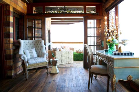
The 1920s speak to a time of lavishness and kitsch collections that somehow surpassed gaudy and became glamorous. Ornate opulence defines this era, a characteristic that makes it a favorite of interior designers. To achieve a 1920s-esque home, focus on the detailing of pieces to incorporate glitz throughout an area.
“The first thing that comes to mind when I think art deco is that beautiful 1920s jewelry,” says Meghan Yang, a Costa Mesa-based interior designer. You can add that style of glitzy jewelry—and similar patterns—to vintage frames that accessorize shelves or liven up walls. Meghan suggests mixing different sizes and shapes to add a depth and complexity while reflecting the over-the-top nature of the time.
Continue to incorporate the feel throughout the house by using crystal hardware on cabinets and drawers, or embed Swarovski buttons into the tufting of a couch. Accent a sofa by adding luxe materials like silk or satin through throw pillows or drapes.
Azita Sadeghi, a coastal Orange County-based interior designer and real estate agent, also recommends purchasing some chandelier light fixtures for both indoor and outdoor spaces.
“It just brings on glamour, … especially in a house that has a lot of woodwork,” Azita says, suggesting Restoration Hardware’s collection of crystal and glass chandeliers.
Era-appropriate chrome accessories, like a boat propeller statue or a telescope, complement what Azita refers to as the “bling” of the crystals in the chandeliers or hardware. The reflective surfaces also lend themselves to be paired with mirrored pieces. Side tables or even a mirrored dresser are a couple of ways to accomplish this look, but Meghan says that homeowners who find this look too overwhelming can also explore lacquer to pay homage to the 1920s.
“People are getting back into painted furniture,” Meghan explains. “… It can be as simple as taking an old vanity, making it teal and adding crystal handles. It’s a whole new, 1920s look.”
1950s: Old-Fashioned Favorites
Midcentury modern interior design in the 1950s pays homage to a post-World War II society looking to preserve rather than splurge. It incorporates easy do-it-yourself projects that give the first nod to using organic shapes. The style’s real claim to fame, however, is the kitchen.
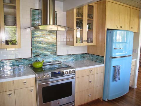
This period marked the decline of the formal dining room and the acceptance of enjoying every meal at a kitchen dinette. To replicate this in the modern home, consider a chrome dinette in a neutral color like white and beige—the subtle shades help keep a dated style contemporary. Streamlined “retro” appliances—fridges, stoves and microwaves from companies like Big Chill that take on an old-fashioned appearance but function with modern technology—can then be added in era-inspired pastel colors like aqua, red or yellow. Those who don’t want a complete appliance makeover can incorporate subway tiles as a colorful backsplash.
“To make them modern, I stack them straight and do them oversized,” Meghan says of the tiles. “…[If] you put in one of those fridges and the subway tiles, … you’ve got an instant throwback.”
Though the kitchen is recognized as the heart of the house, it’s just one room—in order to have this era flourish, nostalgic details need to be sprinkled in other areas without becoming overwhelming. Smaller pieces, like circular coffee tables and sideboards in wood finishes, are easy ways to marry modern sensibility with a 1950s sentiment.
“My parents had an old icebox and we used it just as a side table—[try] something like that, that’s cool and nostalgic but you can use as storage,” Meghan suggests. “Or even bring in a jukebox—something that gives people a warm feeling and sets the pace for the rest of the room.
1960s: Mad About Mod
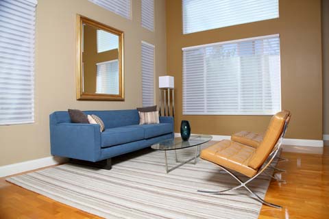
Long considered an undesirable era to look to for home inspiration, the 1960s were incorrectly interpreted to have a cold, industrial style. Meghan explains that only now are people realizing that such preconceptions aren’t necessarily true. The style of modern design popular in the 1960s can be quite lush, she says, and the important aspects to focus on are color, statement pieces and lighting fixtures.
Since whites, grays and blacks are paramount in this era’s look, Azita recommends softer-hued core pieces like couches and rugs in burnt orange, charcoal blue or gold to offset the harshness of the primary palette. Clean, straight lines are essential in recreating the era’s style. For example, Meghan suggests pairing a low-backed black leather sofa with button tufting and pencil arms with accent pillows and a console featuring short brass legs.
“The lines are beautiful, but it needs a little frill,” Meghan explains of that type of couch. “Lush pillows help avoid the harsh, hospital feel.”
Juxtaposing the straight lines of a sofa with a chair boasting curved contours furthers the 1960s aesthetic—consider Wassily chairs or any furniture made or inspired by Charles and Ray Eames, two preeminent modern designers of their time.
For a final touch, look for light fixtures that focus on clean, organic shapes rather than ornate detailing. A rigid bent base or a fluid arched iron fixture featuring a drum shade, like Z Gallerie’s Spring or Enzo floor lamps, work wonderfully with this decade of design. Another option is to use a dramatic ceiling light, which Meghan employs in her own home: “We have a starburst ceiling light with brass detailing paired with a console with brass legs, … but the furniture is really modern,” she explains.
Those feeling a bit more experimental can also add more personality to a space: Meghan suggests using an animal print rug or even putting some mounted antlers in the living room as a nod to the sartorial stylings of the 1960s.
1970s: Swinging Seventies
In an effort to strip interior design of modernism’s strict minimalist approach, the 1970s reintroduced personal flair back into the home. The decade’s style encourages the bold and the bright, but in order to execute this within a contemporary home, you need to think loudly and implement strategically.
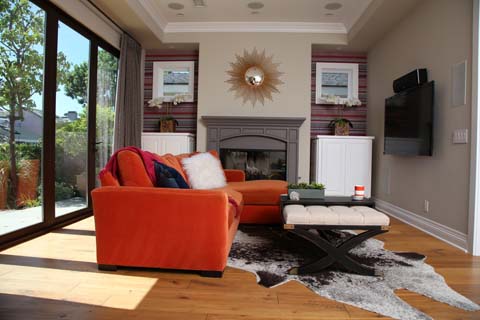
“For a while, people were scared [that] eclectic meant hodgepodge,” Meghan explains of the era she tends to gravitate toward in her own home. “I think now people are realizing eclectic can just mean there’s more texture. A lot of that creates a 1970s vibe in a cleaner, [un]cluttered way.”
Furniture with a contemporary feel works well in this style, accented by 1970s-inspired pieces like Saarinen tulip or Panton chairs. Texture is best incorporated via bold prints on linen or microfiber; for a more tactile approach to texture, use a shag or grass cloth. The latter is best used in rugs, but try to also use the former on pillows, bedding and throws for the most effective homage to the decade.
For an unusual way of introducing different surfaces to the home, Azita suggests finding a faux plant divider (often used in commercial buildings) and topping it off with a tray to make it a table. This provides a real pop of earthy green color and introduces a new texture that can be mirrored in a smaller home accessory, like pillows or hanging plants.
Another approach is to employ primarily solid hues. For this, Meghan suggests using patterned wallpaper in focused accent areas, like window insets, and incorporating linen microfiber and velvet pillows on the furniture. “You’re getting that textural change rather than a bunch of patterns,” Meghan explains, recommending Jonathan Adler as well as Trina Turk to find wallpaper and pieces that evoke the quirks of the 1970s without going overboard. “Another thing I love to do is paint ceilings colors or wallpaper a ceiling so your eye is being drawn up there.”
—
THEMATIC DECOR
Decorating is often about the power of creating spaces, according to local interior designer and real estate agent Azita Sadeghi. Sometimes the best way to celebrate a space is by pulling from themes rather than the times.
New Age Zen
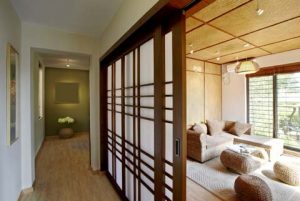
Characterized by strong Asian influences, Zen design focuses on the interaction of light, space and functionality with organic materials and warm earth tones. This results in a minimalist approach to decor in hopes of inspiring a peaceful state of mind.
Nautical Nature
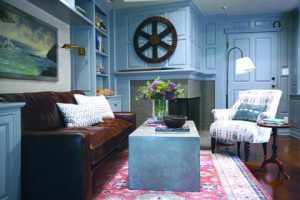
In Newport, nautical is king thanks to proximity to the ocean. It pays homage to the coast with detailing like ropes, anchors, seashells and boats, and calls for subdued beiges, blues, grays and whites offset with bold colors so the space feels clean and fresh rather than sandy.
Victorian Charm
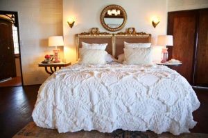
Utilizing decorative detailing, like ornate crown moldings and Tiffany lamps, paired with lush furniture focused on grandeur, Victorian design features a rich color palette with abundant deep hues of browns, purples and blues.
Rustic Chic
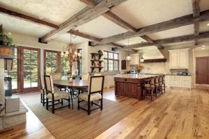
A revival of organic, earthy decor brings unrefined pieces to homes without making them feel like log cabins. Exposed wood or contemporary furnishings with stone and wood detailing along with pops of color keep this look up-to-date.


